I’ve never been a big fan of yellow inks, and it wasn’t exactly love at first sight with this one, but it’s strange because the color kinda grew on me. I started using it to write dates, headers or section titles in my journal entries, and they pop right out the page. It’s a nice shade of yellow, very earthy. It brings to mind that point when leaves aren’t quite dead and dry yet, but the green has just drained out of them.
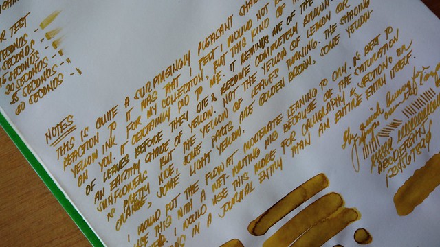
It’s not too light that you can’t read it, but I would recommend that you use it with a wet nib. This page was written with a Pilot vanishing point that has a medium nib. I was intrigued about how it would look with a stub, so…
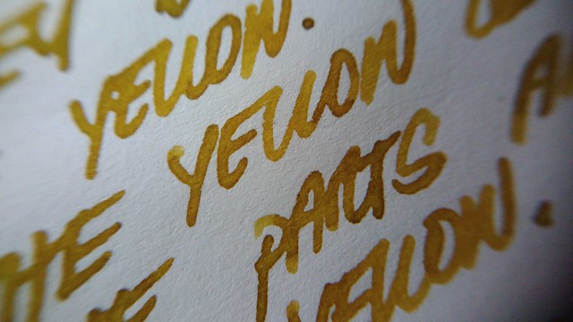
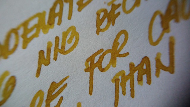
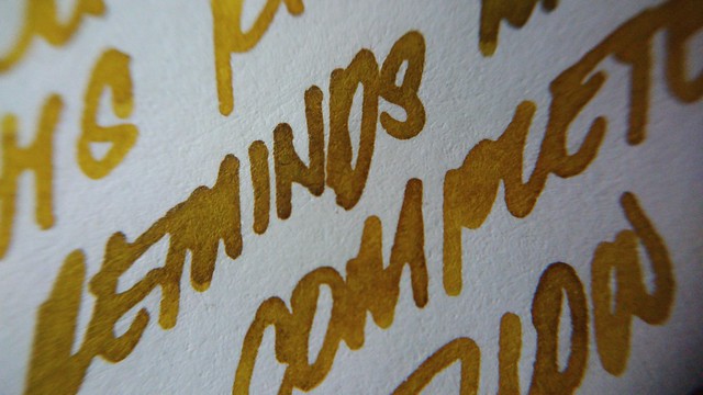
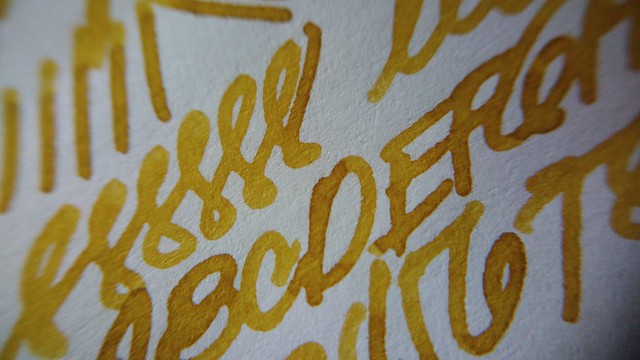
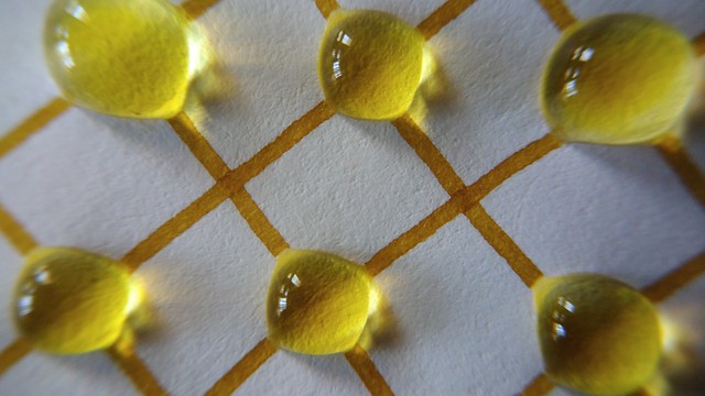
The ink has very expressive shading, and I like that the shading ranges from a golden brown, to yellow orange, to light yellow. Like the color of leaves as they dry. The ink might be too light if you’re using a fine nib, though. It’s best used with wider and wetter nibs so you can appreciate the complexity of the color. I’m surprised that I like this ink as much as I do, honestly.
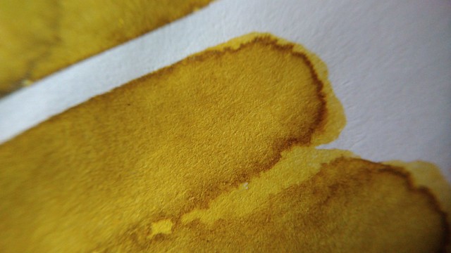
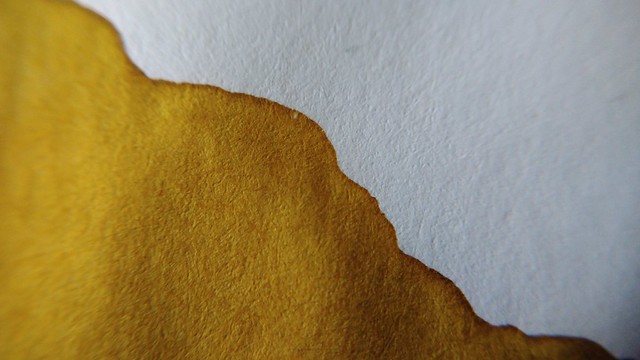
I would put the flow at a moderate, depending on what pen you use with it. With my stub nib, it flowed a touch on the wet side. With my medium nib, it flowed moderate, a touch on the dry side. It dried at a little over 20 seconds on Tomoe River paper. It’s not water resistant, it washes away quite beautifully, actually. I think it’s a great ink for creative applications. Maybe not something you would use to sign your checks, but something to add a splash of color to your journals. Me likey.
Here are a few close up photos of the writing samples:
Kyoto inks are available at Everything Calligraphy.
Here’s a roundup of all the Kyoto Inks I have reviewed:

10 thoughts on “Review: Kyo No Oto Yamabukiiro”